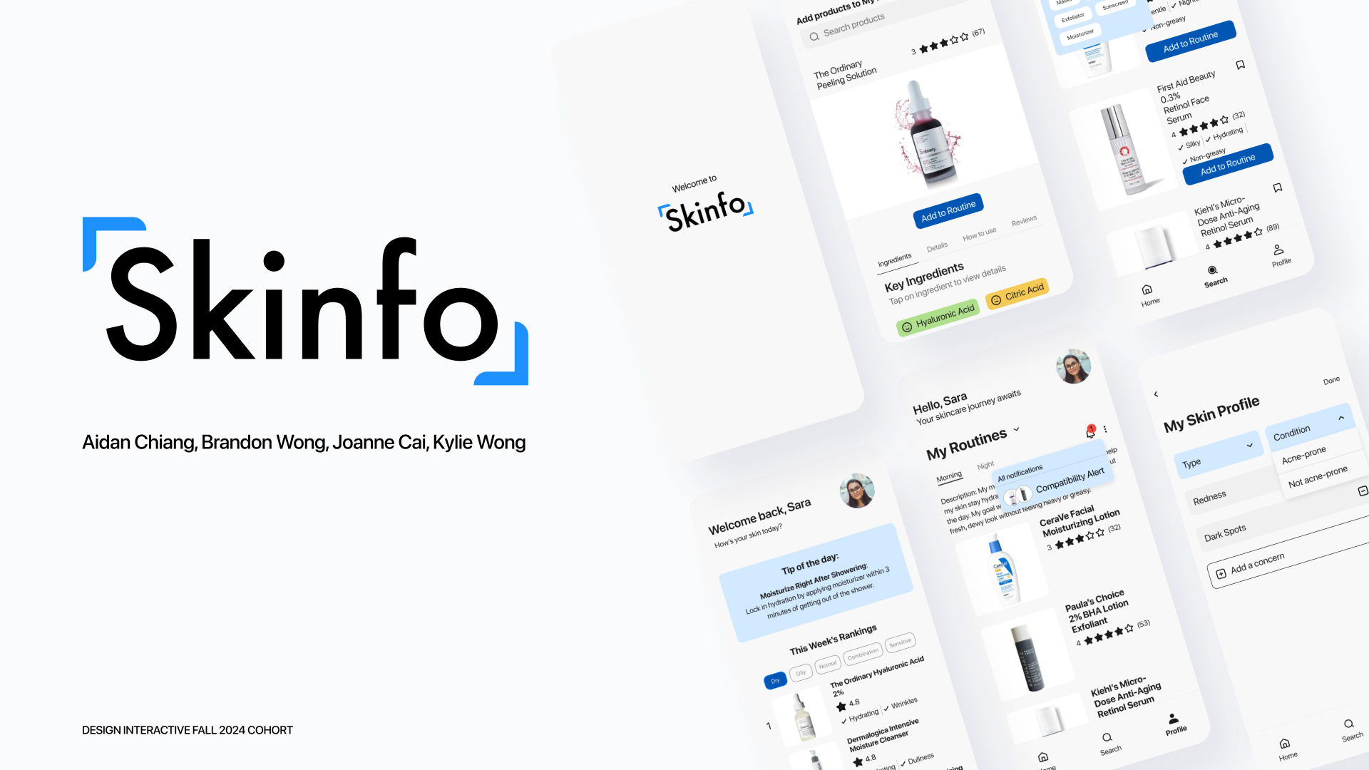
Introduction
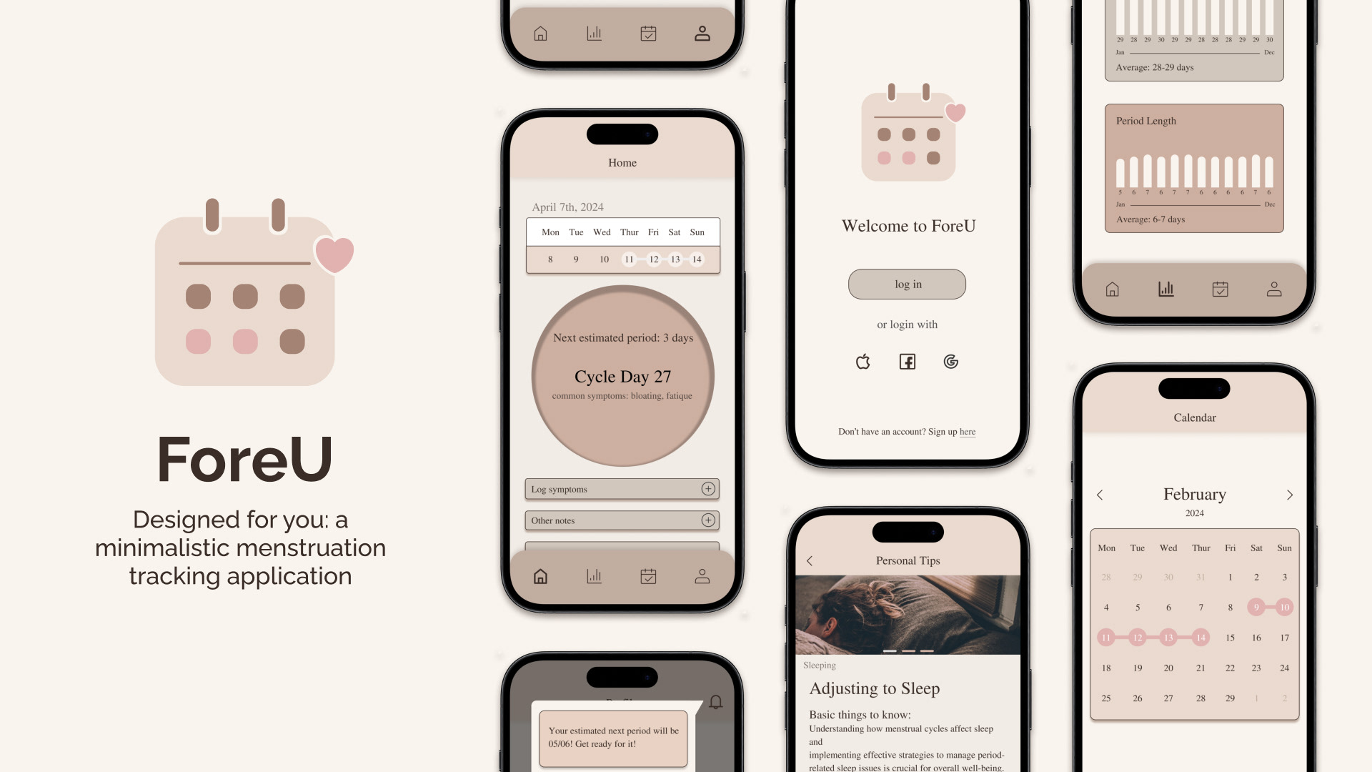
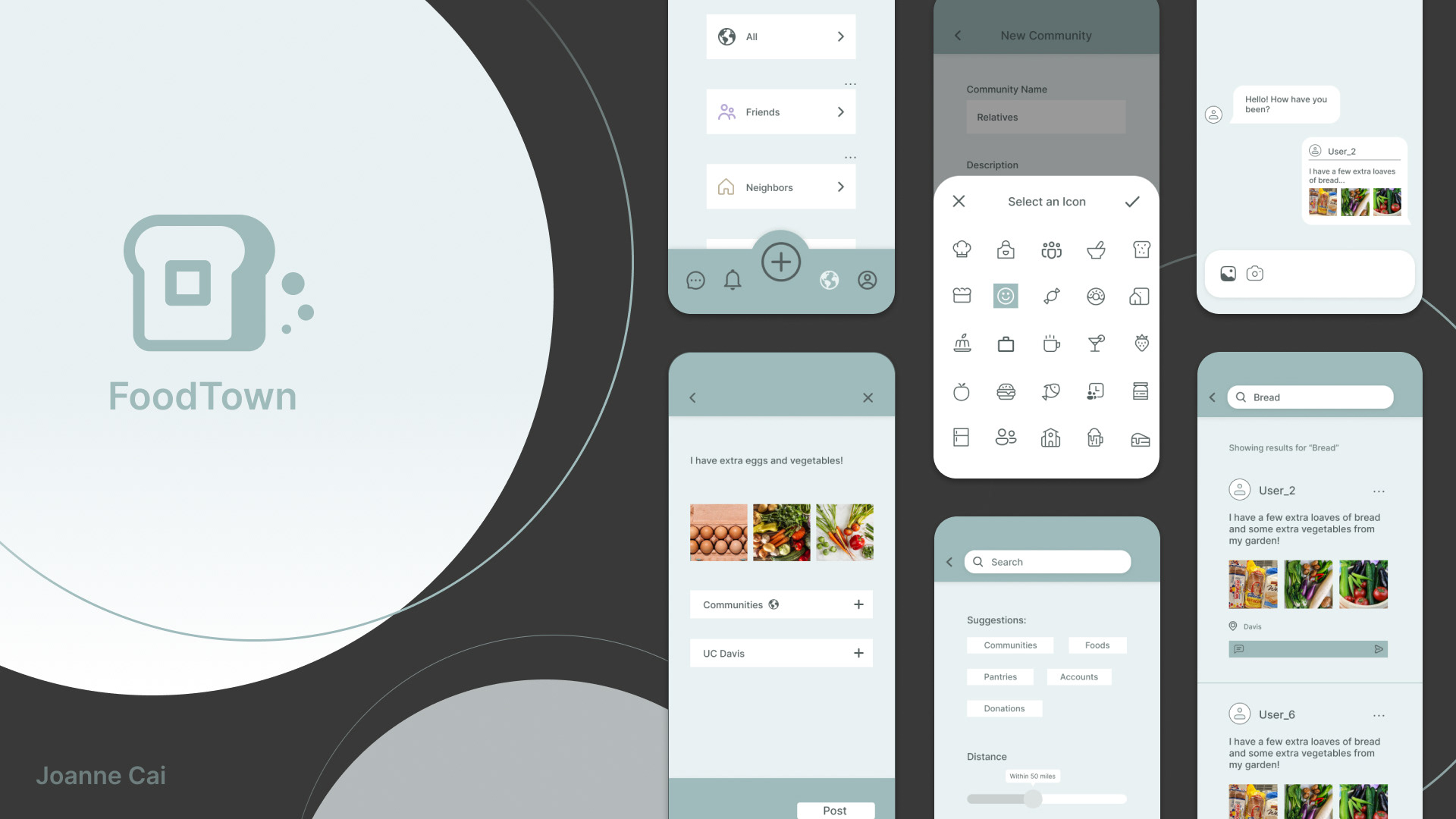
FoodTown is an app that provides a platform for people to share and receive foods among their communities. FoodTown has a social media part to it where users could post their excess foods or could request for foods. Users could also private chat with each other to communicate during the food giving or receiving process.
Research
Survey
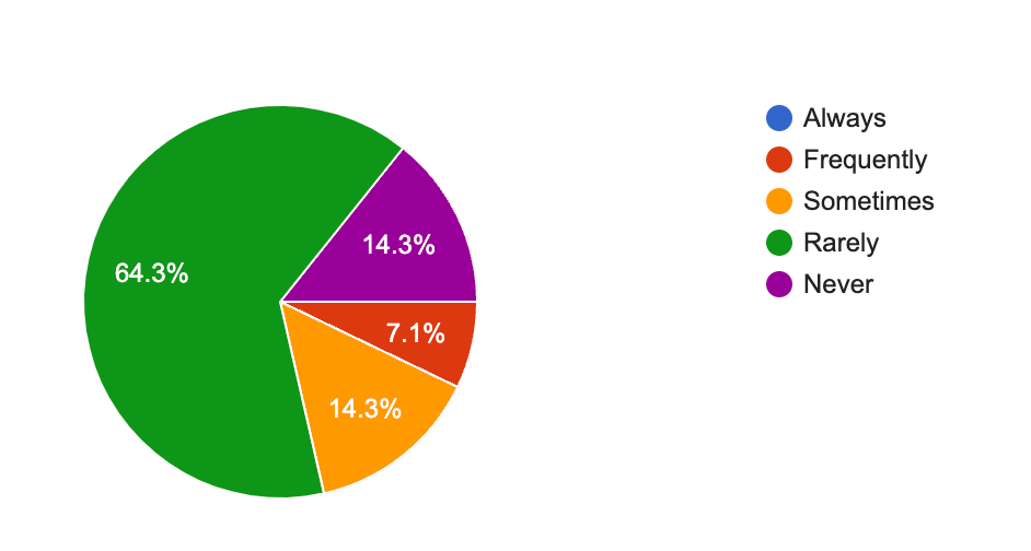
I conducted a survey to gather information about user pain points when facing food waste or food insecurity.
Personas
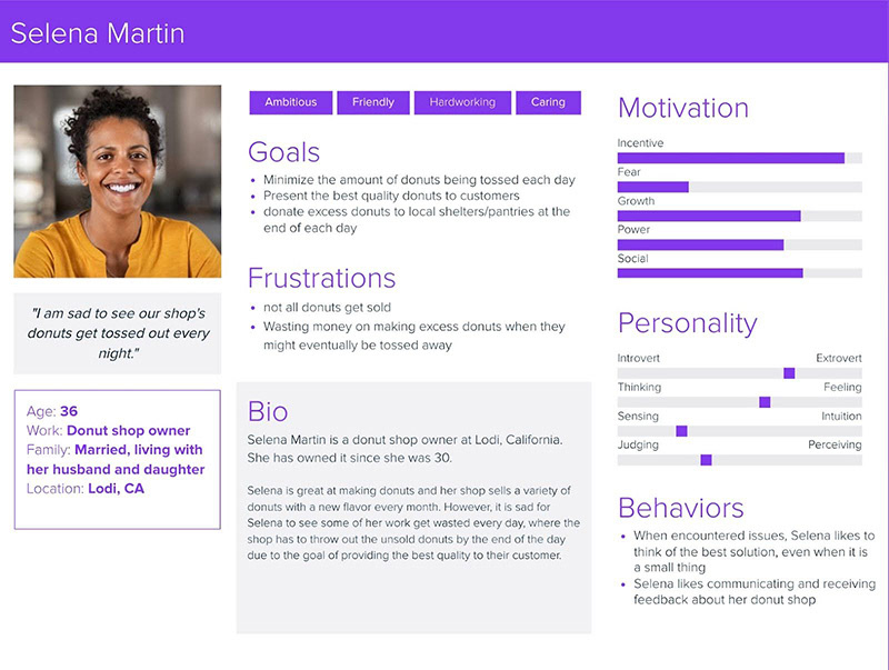
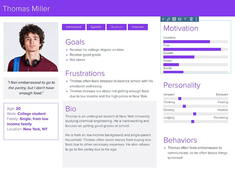
I created two personas that represent the two types of users for FoodTown. One side involves the people who are in need to get rid of their excess food. My persona, Selena Martin, is an example from this side, while my second persona, Thomas Miller, is an example of the other side that involves people who are in need to get enough food.
Insights
For minimizing food waste, a couple responses mentioned about planning ahead and keeping a list of grocieries to avoid buying too much food. For dealing with excess food, a couple responses mentioned using new recipes for the food, and many responses mentioned giving the food away if they have not gone bad.
Ideation
Usability Testing
I did two rounds of usability tests with 6 users. The first round includes the tasks of create a community, chat, and search. The second round included all of the tasks in round 1 with an additional task of create a post.
I did two rounds of usability tests with 6 users. The first round includes the tasks of create a community, chat, and search. The second round included all of the tasks in round 1 with an additional task of create a post.
From the usability testing, I realized that many buttons for my prototype are not big enough as I observed almost all of my users have trouble clicking on those buttons. Most users made the suggestion of enlarging those buttons.
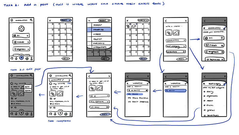
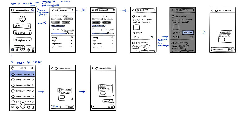
In the first round of the usability test, during the search task, I observed that most of my users went straight to the search bar without using the filter feature first during the search task.
• A few users mentioned that the filter feature was confusing and they did not know if they needed to use it before searching. Another user made a suggestion to make the filter optional.
• Before the second round, I reiterated the search task by making the filter feature optional and only limiting a preferred distance for their search. I changed the search category feature to “Suggestions”, where it now acts as a quick search feature. In the second round of the usability test, I observed less confusion when users are performing the search task. However, some of them did not know that the tabs under “Suggestions” are quick-search tabs.
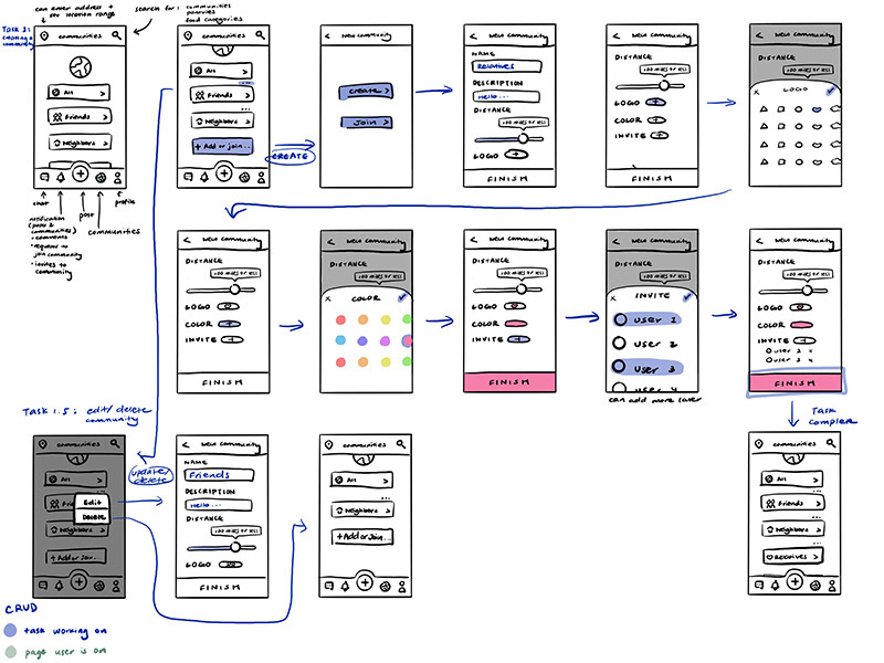
In the first round of the usability test, most of my users were also confused on where to create a community, as my plus icon for creating a post on the bottom bar is very visible while the “Add more…” for creating a community is not clear enough for them.
• Before the second round of the usability test, I changed “Add more…” to “Create a Community” to be more direct on what the button does.
• In the second round, I observed no confusion from my users when they wanted to create a community.
• Before the second round of the usability test, I changed “Add more…” to “Create a Community” to be more direct on what the button does.
• In the second round, I observed no confusion from my users when they wanted to create a community.
In the first round of the usability test, most of my users were also confused on whether or not they had selected an icon during the task of creating a community, since the feedback there is not enough for them. The feedback I had at that time was a color change on the selected icon. Some of my users mentioned that the color was too light and not too visible.
• Before the second round of the usability test, I experimented with different changes for the feedback such as changing the color and making the strokes thicker. However, those did not look cohesive with my design. Eventually, I placed a square with a color from my color scheme behind the selected icon.
• In the second round, users were not confused when they selected the icon.
One user liked my consistency of circular icons and suggested that I round the corners of the rectangular tabs such as the community tabs.
A few users mentioned that although my use of colors is visually appealing and provides ease on the eyes, they suggested me to put more color contrast.
A few users mentioned how the text I have is easy to read and consistent, they suggested that I should experiment more with typography
Hi-Fi Prototyping
Next Steps
For further refining my project, I plan to experiment with typography more. I want to try out how different fonts would look with FoodTown and also try different font sizes to create a better hierarchy. Adding to typography, I plan to also enlarge some of the texts to make them easier to read. Another thing that I want to improve on is the use of colors. I plan to use more colors to create color contrast while also keeping FoodTown easy to read and consistent throughout. I also want to further refine the search task. I plan to reiterate the filter feature, maybe by having an icon that organizes the filter feature to separate the functions in the search page better.
If I were to continue with my project, I would design all other tasks and refine the existing tasks more. A future problem is about safety because if users decide to meet up to give or take the food, there might be scammers, kidnappers, etc., so maybe I should include an identity verification part when I design the onboarding portion.